My first attempt at generative art with Python
NOTE: Since it’s 2023: If you’re looking for insights on how to generate images with the latest text-to-image models like stable diffusion, this post is not for you. 💭“Maybe that’s something to explore in a future post 🤔”
I was inspired by Danielle Navarros post on generative art (Navarro, Danielle. 2021. “Unpredictable Paintings.” November 1, 2021. https://blog.djnavarro.net/unpredictable-paintings.), the first time I read it (you should check out her beautiful gallery). Now I found time to try it out myself and would like to share my first steps with you.
Code:
You can just skip my thoughts and find all the code in this notebook. (Have fun with it 😃)
Setup
To start simple, I will only use the packages numpy and matplotlib.
import numpy as np
import matplotlib.pyplot as plt
%matplotlib inline
First attempt
I started with the idea that the fill_between() function of matplotlib could show quite chaotic behavior if not used properly. So my very first attempt was to just create two random lines and use fill_between() on them and this is what I got:
x = np.arange(100)
y1 = np.random.normal(0, 1, 100) + np.sin((x-5))
y2 = np.random.normal(0, 2, 100) + np.sin(x)

plt.figure(figsize=(12,10))
plt.plot(y1)
plt.fill_between(x, y1=y1, y2=y2)
plt.xticks([])
plt.yticks([])
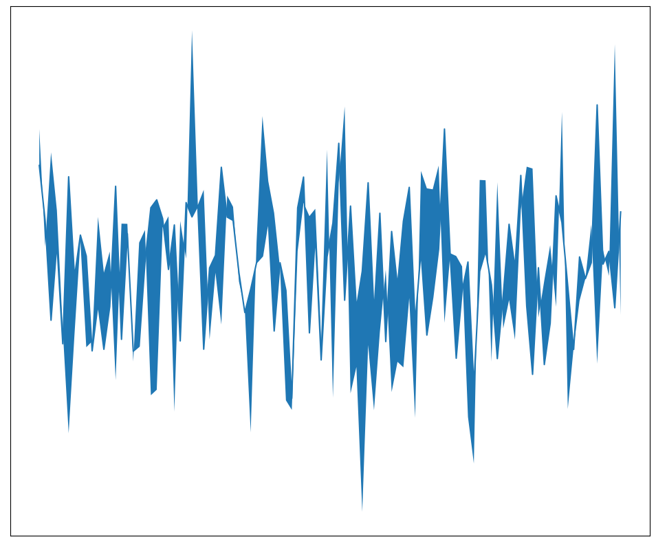
Not too bad. I think there is potential in here.
Second attempt
Based on the first attempt I tried out a few changes:
- make the background dark because why not (I played around with some of the styles that matplotlib offers (see
plt.style.available) but stayed with the simple “dark_background”) - add gaps in
fill_between()using thewhere=parameter- my goal here was to add even more randomness
- for the implementation I built a list of 1’s and 0’s that I randomly permutated (I also added a ratio with which I can control how much of the full range should be filled)
- make the two lines follow a sine vs. a cosine function to get more variation in the distance between them (before it was 2 sines)
Let’s check the result:
plt.style.use('dark_background')
n = 1000
x = np.arange(n)
y1 = np.random.normal(0, 0.2, n) + np.cos(x/100)
y2 = np.random.normal(0, 0.2, n) + np.sin(x/100)

plt.figure(figsize=(12,10))
plt.plot(y1)
n_ones = int(np.floor(n*0.6))
plt.fill_between(x, y1=y1, y2=y2, where=np.random.permutation(np.array([1]*n_ones + [0]*(n-n_ones))))
plt.gca().set_axis_off()
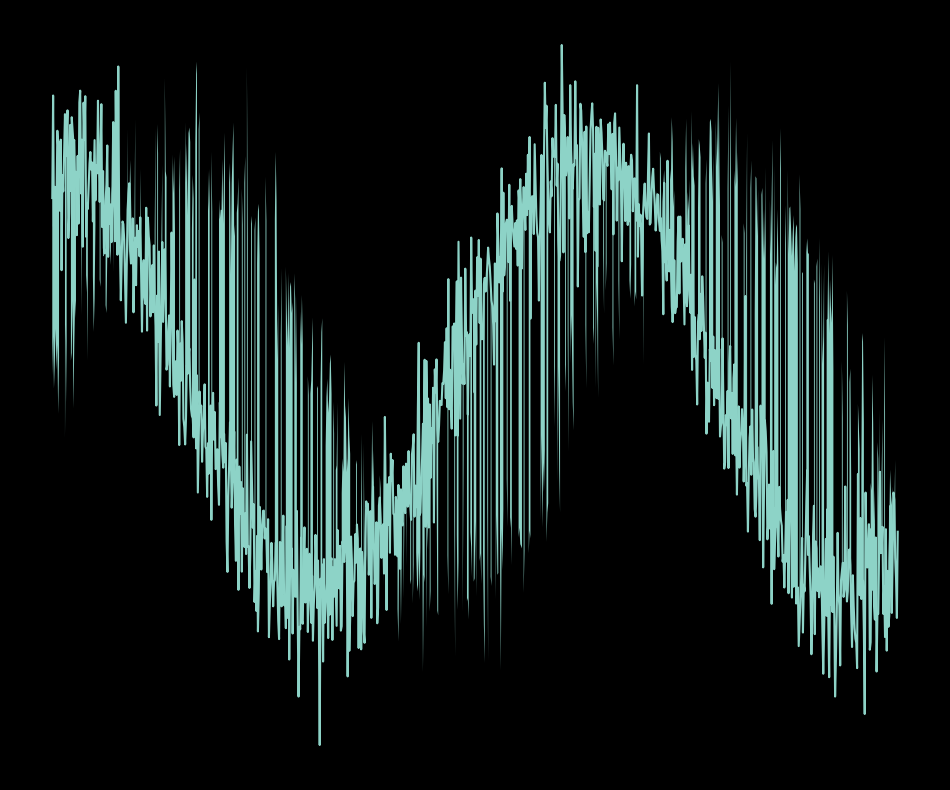
Okay, this changed the result quite a bit. While I like the dark background, I don’t like the color of the lines. Another thing that I don’t like is that it’s just standard sine curves and that the noise that I added via the random gaps for fill_between() is too homogenous. Let’s try to address these issues next.
Third attempt
Here is what I changed for the next version:
- I played around with colormaps for the the fill_between and the different lines. In the end I settled on using “plasma” for all of them.
- I also added the underlying sinusoidal curve to the plot. I like that it gives you a hint on where the noise “comes from”.
- Finally, I added a linear scaling of the sinusoids, because why not.
plt.style.use('dark_background')
n = 2000
x = np.arange(n)
y1 = (np.random.normal(0, 0.3, n) + np.cos(x/100))*x/n*0.3
y1_denoised = np.cos(x/100)*x/n*0.3
y2 = (np.random.normal(0, 0.3, n) + np.sin(x/100))*x/n

plt.figure(figsize=(12,10))
my_cm1 = plt.cm.plasma
my_cm2 = plt.cm.plasma
plt.plot(y2, color=my_cm1(np.random.randint(1, 256)), alpha=0.5)
plt.plot(y1_denoised, color=my_cm1(np.random.randint(1, 256)), lw=1)
#plt.plot(y1, color=my_cm2(np.random.randint(1, 256)), alpha=0.5)
n_ones = int(np.floor(n*0.2))
plt.fill_between(x, y1=y1, y2=y2, where=np.random.permutation(np.array([1]*n_ones + [0]*(n-n_ones))), color=my_cm2(np.random.randint(1, 256, size=n)))
plt.gca().set_axis_off()
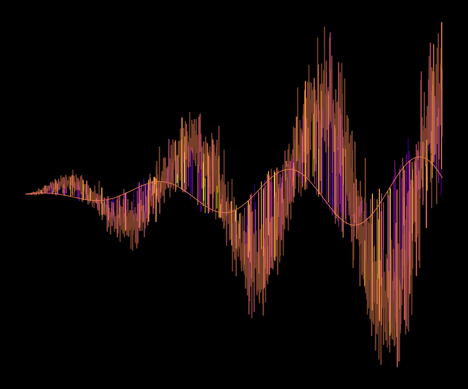
Yes, I like the direction that this is going. The colors are good for now, so I will keep them fixed. But the shape too boring, I need to mess around more …
Attempt Nr. 4
During this next attempt I got a bit lost. I had the idea of adding a circular element on top of the existing curves but failed to do so 💭“I still think it could result in something cool, I should give it another go some other time 🤔”. But see for yourself:
plt.style.use('dark_background')
n = 2000
r = 1
scale = r/n
x = np.arange(-(n//2), (n//2)) * scale
y_circle = np.sqrt(r**2 - x**2)
y1 = (np.random.normal(0, 0.1, n) + np.cos(x*10))*x + y_circle
y1_denoised = np.cos(x*10)*x + y_circle
y2 = (np.random.normal(0, 0.1, n) + np.sin(x*10))*x + y_circle

plt.figure(figsize=(12,10))
my_cm1 = plt.cm.plasma
my_cm2 = plt.cm.plasma
plt.plot(x, y1_denoised, color=my_cm1(np.random.randint(1, 256)))
plt.plot(x, y1, color=my_cm2(np.random.randint(1, 256)), alpha=0.5)
n_ones = int(np.floor(n*0.2))
plt.fill_between(x, y1=y1, y2=y2, where=np.random.permutation(np.array([1]*n_ones + [0]*(n-n_ones))), color=my_cm2(np.random.randint(1, 256, size=n)))
plt.gca().set_axis_off()
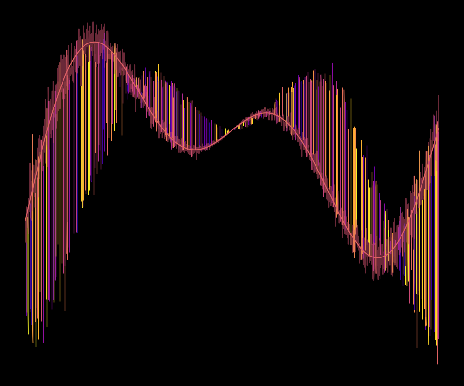
As you can see, there is not a big difference to before. The linear scaling from before became a quadratic scaling that starts in the center and increases to both sides and that’s about it. I need a different approach.
5: Breakthrough!
The final breakthrough came with the idea of messing with the array of x coordinates. After some experiments I found the best results with dividing the x array into a number of parts and then permutating these parts randomly. Another minor change was to reduce the amount of noise for the where parameter of fill_between(), going from values of 0.6 or 0.1 to 0.9, i.e. only 10% of the area will not be filled. Let’s check the result:
plt.style.use('dark_background')
my_seed = 2
np.random.seed(my_seed)
n = 2000
x = np.arange(n)
n_parts = 10
part_size = n//n_parts
x_distorted = np.concatenate(np.random.permutation([x[start:start+part_size] for start in np.arange(n, step=part_size)]))
y1 = (np.random.normal(0, 0.3, n)*0 + np.cos(x/100))*x/n*0.3
y1_denoised = np.cos(x/100)*x/n*0.3
y2 = (np.random.normal(0, 0.3, n)*0 + np.sin(x/100))*x/n

plt.figure(figsize=(12,10))
my_cm1 = plt.cm.inferno
my_cm2 = plt.cm.inferno
plt.plot(x_distorted, y2, color=my_cm1(np.random.randint(1, 256)), alpha=0.5)
plt.plot(x_distorted, y1_denoised, color=my_cm1(np.random.randint(1, 256)), lw=1)
#plt.plot(y1, color=my_cm2(np.random.randint(1, 256)), alpha=0.5)
n_ones = int(np.floor(n*0.9))
plt.fill_between(
    x_distorted,
    y1=y1,
    y2=y2,
    where=np.random.permutation(np.array([1]*n_ones + [0]*(n-n_ones))),
    color=my_cm2(np.random.randint(1, 256, size=n)),
    alpha=0.7
)
plt.gca().set_axis_off()
plt.savefig(f'first_gen_art_seed_{my_seed}.png')
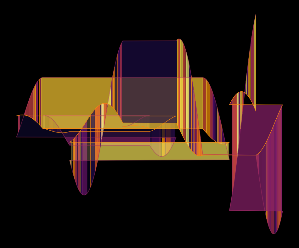
Wow, look at this! I was pleasantly surprised by this because I didn’t expect the randomly colored squares that appear at the “cutting points” between the parts but like to think of it as happy accident :). In this code I already introduced some parameters with which you can play around to get very different results. So to wrap this up, in the following I
- split the code into a function for building the data points and one for plotting them
- add the possibility to set a different colormap
- add an option to save the result as a figure with the important parameters in the filename
- used ipywidgets to explore the parameters interactively in the notebook
Code for plot generation
import ipywidgets as widgets
from ipywidgets import interactive
import matplotlib.pyplot as plt
import numpy as np

possible_colormaps = plt.colormaps()

def build_curves(n=2000, n_parts=10, noise_factor=0, seed=2, max_x_shift=0, max_y_shift=0):
    np.random.seed(seed)
    x = np.arange(n)
    part_size = n//n_parts

    x_chunks = [x[start:start+part_size] for start in np.arange(n, step=part_size)]
    x_chunks = [chunk for chunk in x_chunks if len(chunk) == part_size]

    for chunk in x_chunks:
        chunk = chunk + np.random.randint(-max_x_shift, max_x_shift)

    x_distorted = np.concatenate(np.random.permutation(x_chunks))
    x = x[:len(x_distorted)]
    n = len(x)

    y1 = (np.random.normal(0, 0.3, n)*noise_factor + np.cos(x/100))*x/n*0.3
    y1_denoised = np.cos(x/100)*x/n*0.3

    y2 = (np.random.normal(0, 0.3, n)*noise_factor + np.sin(x/100))*x/n

    for chunk in x_chunks:
        y1[chunk] = y1[chunk] + np.random.rand()*max_y_shift
        y2[chunk] = y2[chunk] + np.random.rand()*max_y_shift

    return x, x_distorted, y1, y2, y1_denoised

def plot_curves(x, x_distorted, y1, y2, y1_denoised, cmap_name, filling_ratio):
    fig = plt.figure(figsize=(8,8));
    cmap = plt.cm.get_cmap(cmap_name);

    plt.plot(x_distorted, y2, color=cmap(np.random.randint(1, 256)), alpha=0.5);
    plt.plot(x_distorted, y1_denoised, color=cmap(np.random.randint(1, 256)), lw=1);

    n_ones = int(np.floor(len(x)*filling_ratio))
    plt.fill_between(
        x_distorted,
        y1=y1,
        y2=y2,
        where=np.random.permutation(np.array([1]*n_ones + [0]*(len(x)-n_ones))),
        color=cmap(np.random.randint(1, 256, size=n)),
        alpha=0.7
    );
    plt.gca().set_axis_off();
    return fig

def generate_curves(n=2000, n_parts=10, noise_factor=0, seed=2, max_y_shift=10, cmap_name='inferno', filling_ratio=0.9):
    x, x_distorted, y1, y2, y1_denoised = build_curves(n, n_parts, noise_factor, seed,  max_y_shift)

    fig = plot_curves(x, x_distorted, y1, y2, y1_denoised, cmap_name, filling_ratio)

def save_generated_curves(n=2000, n_parts=10, noise_factor=0, seed=2,  max_y_shift=0, cmap_name='inferno', filling_ratio=0.9):
    x, x_distorted, y1, y2, y1_denoised = build_curves(n, n_parts, noise_factor, seed)

    fig = plot_curves(x, x_distorted, y1, y2, y1_denoised, cmap_name, filling_ratio);
    fig.savefig(f'curves_n={n}_n_parts={n_parts}_noise_factor={noise_factor}_seed={seed}_cmap={cmap_name}_filling_ratio={filling_ratio}.png');
    plt.close()

save_generated_curves(n=2630, n_parts=41, noise_factor=0, seed=1171, cmap_name='Dark2', filling_ratio=0.4)
Code for interactive plot in the notebook
from ipywidgets import Button, HBox, VBox

interactive_plot = interactive(
    generate_curves,
    n=widgets.IntSlider(
        value=2000,
        min=100,
        max=5000,
        step=10
    ),
    n_parts=widgets.IntSlider(
        value=10,
        min=1,
        max=100,
        step=1
    ),
    noise_factor=(0, 1, 0.01),
    seed=(1, 5000),
    max_y_shift=widgets.FloatSlider(
        value=0,
        min=-3,
        max=3,
        step=0.1
    ),
    cmap_name=possible_colormaps,
    filling_ratio=widgets.FloatSlider(min=0.1, max=0.99, step=0.1, value=0.8),
)
output = interactive_plot.children[-1]
output.layout.height = '700px'

button = widgets.Button(
    description='Save as image',
    disabled=False,
    icon='check' # (FontAwesome names without the `fa-` prefix)
)
def save_figure(button):
    save_generated_curves(
        n=interactive_plot.children[0].value,
        n_parts=interactive_plot.children[1].value,
        noise_factor=interactive_plot.children[2].value,
        seed=interactive_plot.children[3].value,
        cmap_name=interactive_plot.children[4].value,
        filling_ratio=interactive_plot.children[5].value
    )

button.on_click(save_figure)

HBox([interactive_plot, button])
Reflection
Looking back at this session, I definitely had some fun to just mess around with the plot in different ways. I was also bit frustrated in between when ideas don’t get anywhere promising or the execution is more complicated than expected. In the end, I’m super happy with the result and with the interactive art generator that I made 😃.
I also think that there are many promising ways to extend this function. For example, I would try to add random shifts to the parts on both the x and the y axis, which should result in non-rectangular patches that can also span the plot diagonally. I would also check out the techniques that Danielle Navarro teaches in her course, which is available at art-from-code.netlify.app.
Anyway, that’s it. That was my first attempt at generative art with python. Since it’s also the first blog post that I’m publishing I’d be very happy to hear any feedback from you. Maybe you liked the writing style? Maybe you hate it and know exactly what I need to do to improve it? Or maybe you did something similar and want to share your experience? Or maybe you tried out the code and generated some cool plots yourself?
Bonus - Other samples of “curves”
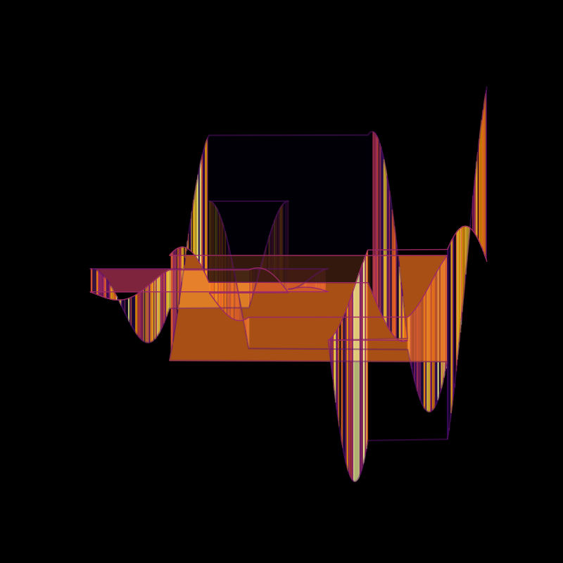 (curves_n=2000_n_parts=10_noise_factor=0.0_seed=1211_cmap=inferno_filling_ratio=0.7999999999999999)
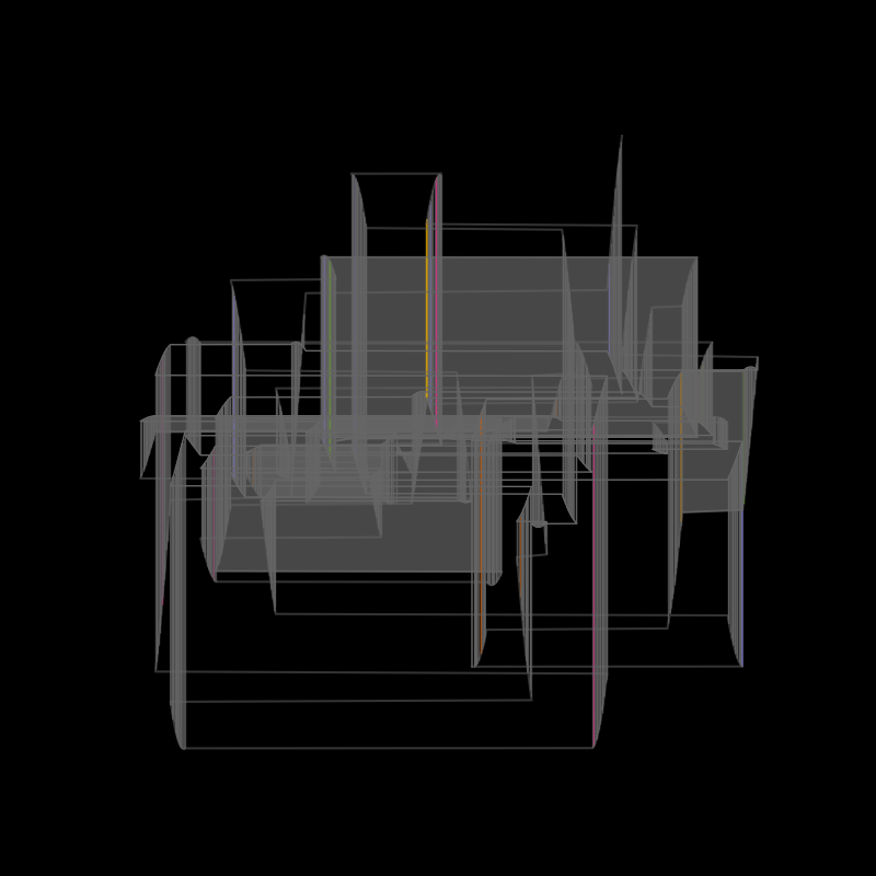 (curves_n=2630_n_parts=41_noise_factor=0_seed=1171_cmap=Dark2_filling_ratio=0.4)
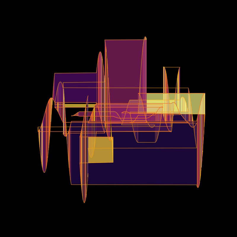 (curves_n=3700_n_parts=20_noise_factor=0.0_seed=728_cmap=inferno_filling_ratio=0.7999999999999999)